Myleen Hollero
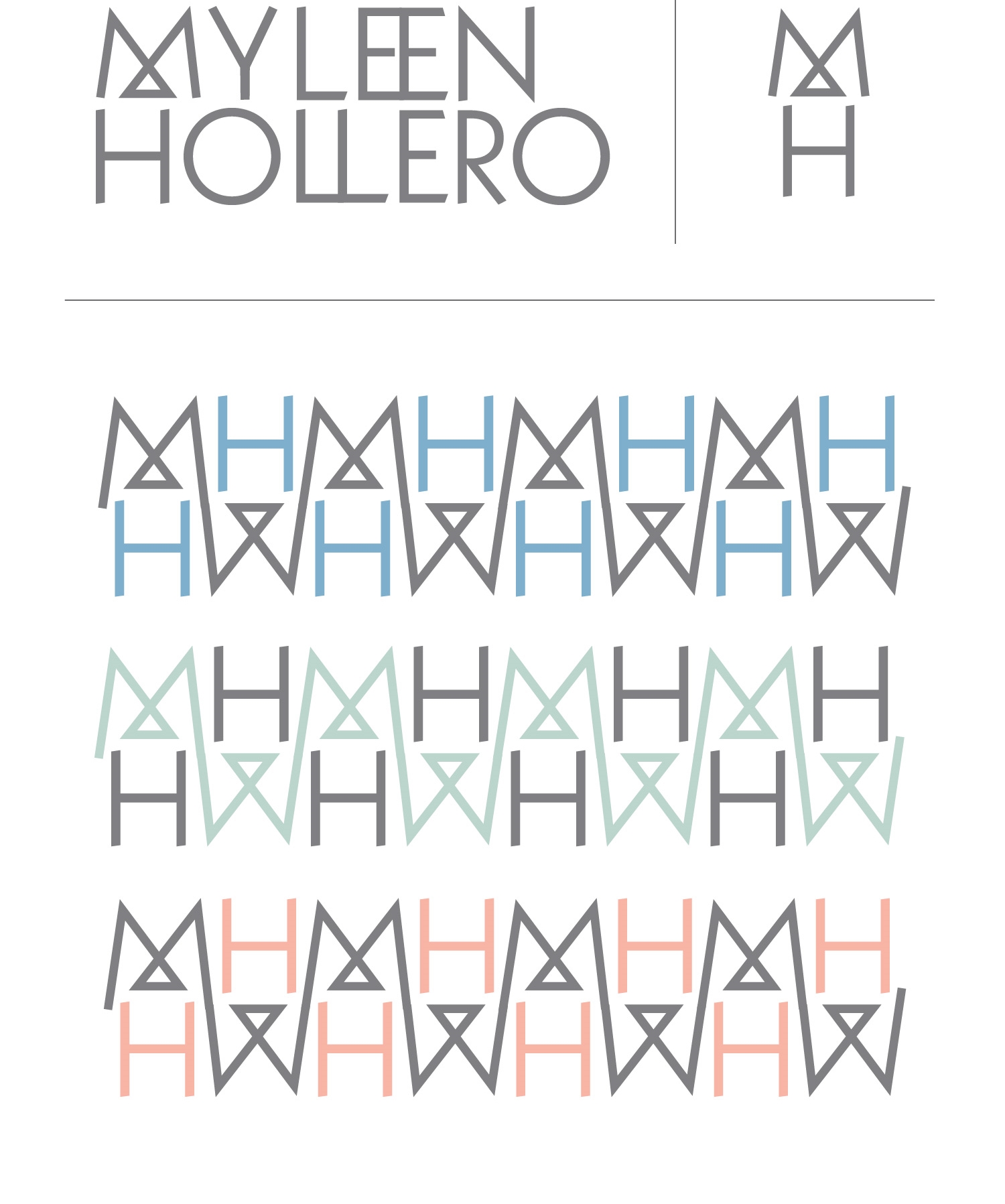
Photographer Myleen Hollero's typographic identity is clean and plays up the double letters in her name. The business card is letterpress on both sides in cool grey ink.
Myleen came to Gold with a pretty clear idea of what she wanted—simple, modern and geometric. With this in mind we did a few concepts exploring the double E and double L ligatures, playing with the negative space in the letters, and the simple shapes representing photography lenses.

